<aside> 🟢
+10% Revenue Per Visitor in 90 days. Or we refund the engagement.
We ran 52 tests on Perfect White Tee. Nineteen winners worth $886,134 a month in revenue lift. Here is exactly what we changed and how you copy it on your store.
</aside>
Perfect White Tee is a California apparel brand (perfectwhitetee.com). We ran a full experimentation program across the homepage, collection pages, PDPs, cart, and checkout. Fifty-two tests shipped. Nineteen won and are live adding revenue. Twenty-two lost and told us where not to spend the next test. The winners add $886,134 a month.
The number you should sit with is not the wins. It is the 22 losers. A 19-from-52 win rate is what a serious program looks like, and the losers are where the money hides. One cart redesign that lost would have cost this brand six figures a year if we had rolled it out on a hunch. You do not get that protection from a redesign. You get it from a test.
| Result | Count |
|---|---|
| Total tests | 52 |
| Won (live) | 19 |
| Lost | 22 |
| Inconclusive | 4 |
| Pending | 6 |
| Blocked | 1 |
| Monthly revenue lift (winners) | $886,134 |
These four carry the screenshots, and they happen to map to the four levers that move any apparel store: collection-page imagery, PDP value props, product titles, and product copy. If you steal four ideas from this page, steal these.
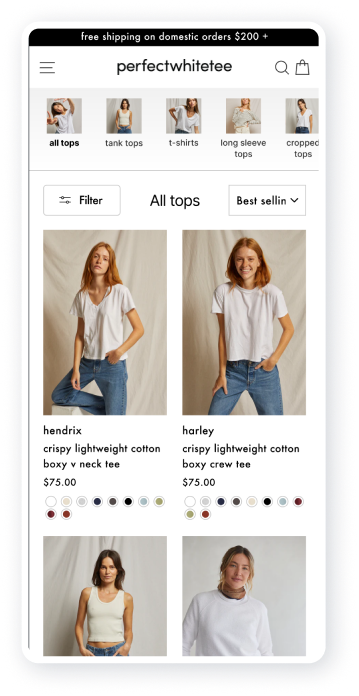
Your collection page is a hunting ground. The customer is scanning for the one product they actually want, and every product they cannot see is a product they cannot buy. We increased the number of images shown in the collection-page carousels. CVR rose 7.1%. RPV rose 10.19%, above 94% confidence. It was the single biggest win of the program.
The logic is boring, which is why it works. More imagery lets people niche down to the right product faster, so fewer of them bounce before they ever reach a PDP.
Control
Collection page carousel control
Variant
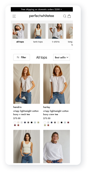
Collection page carousel variant
<aside> 🟢
Steal this: Open your top collection page and count the product images visible before a scroll. If the carousel shows one or two angles per product, add more. People shopping apparel sort visually. Give them more to sort.
</aside>
The moment a customer reaches for a size is the moment of highest intent and highest doubt. That is where you answer the objection, not in a footer nobody reads. We dropped three USPs directly above the size selectors on the PDP. The variant beat the control on every metric, with a 34% jump in profit per visitor.
Control
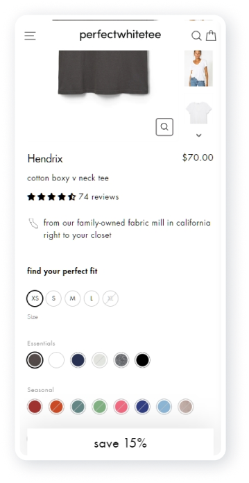
Itemized USPs control
Variant
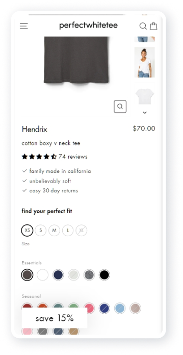
Itemized USPs variant
One caveat that will save you a test. We tried to push this further by swapping "Family made in California" for "Made in USA." It lost twice. This brand's customers have a stronger connection to the California story, and you only find that out by testing the copy, not the concept. The win was never "add USPs." It was finding the exact claim that lands here.
<aside> 🟢
Steal this: Put your three strongest reasons to buy directly above your size or variant selector on your top PDP. Then test the wording, not just the placement. The specific claim that resonates with your audience is worth more than the generic one everyone uses.
</aside>