By Jayden Grayston · Founder @ MoreConversions
This guide covers 29 ways to optimize your Shopify checkout. I’ve included real examples and how to implement the changes on your own store.
<aside> 📋
In this guide
</aside>
7 to 9 figure Shopify brands on Shopify Plus that want to optimize their store. Checkout is the #1 place to start. You can start implementing this stuff today without overcomplicating things.
Three examples of 9 figure brands optimizing their checkout:
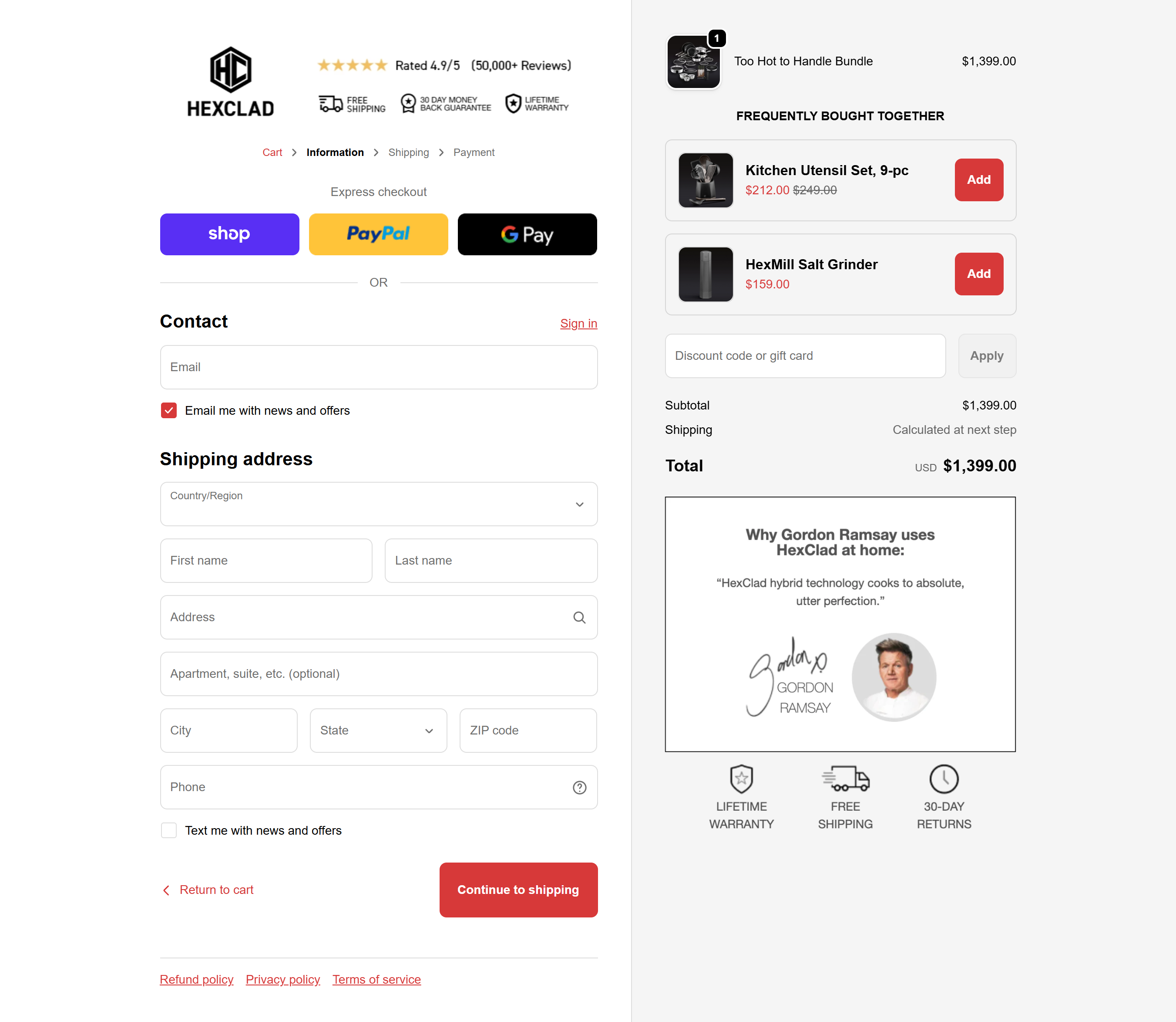
HexClad
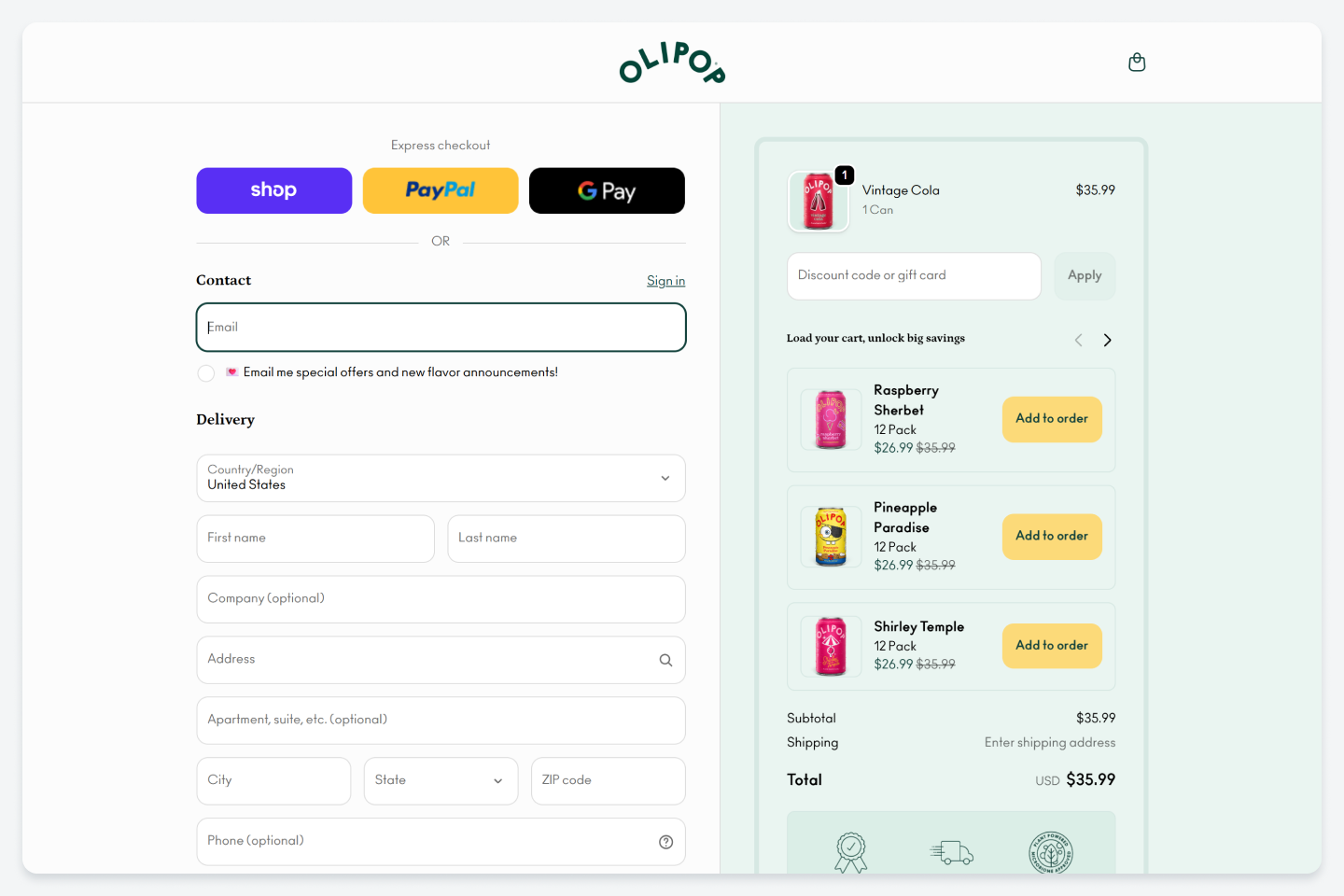
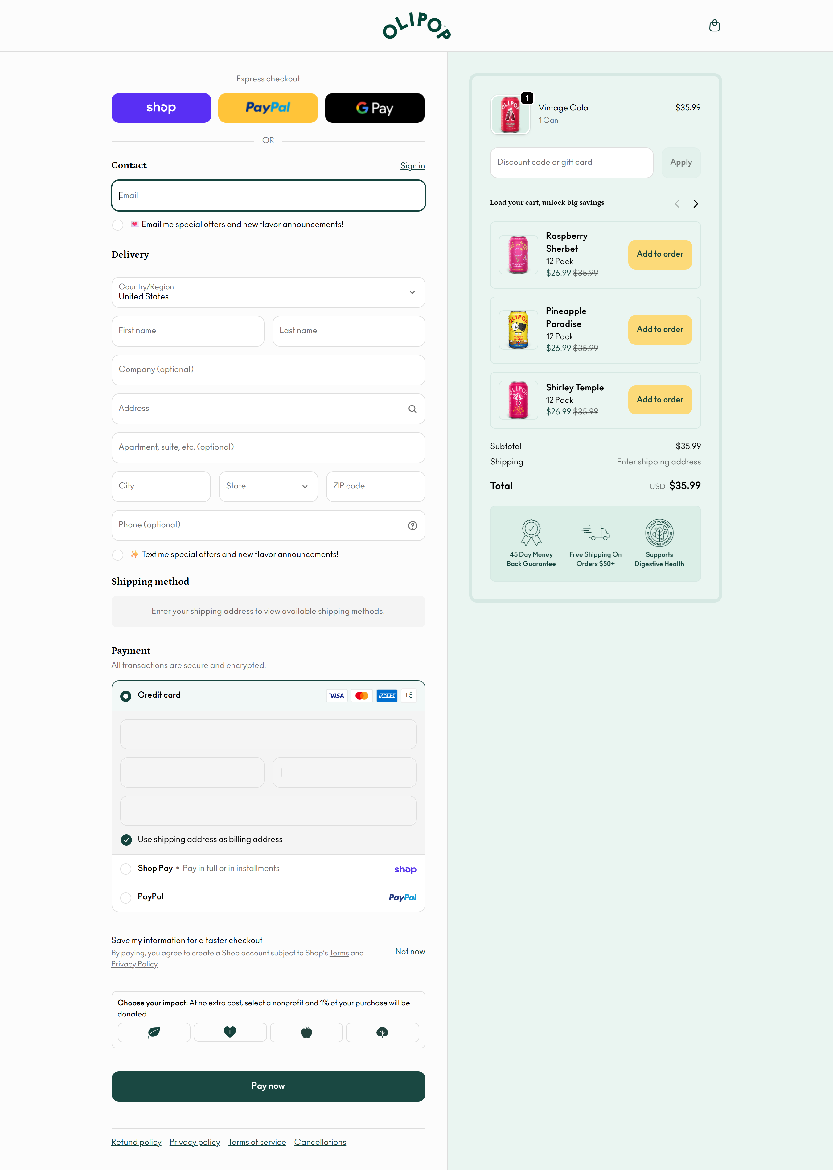
Olipop
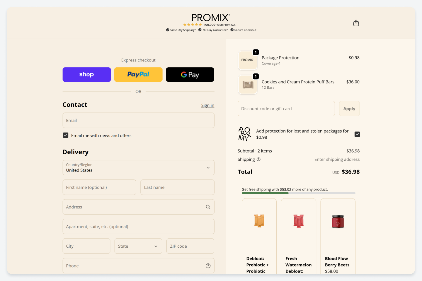
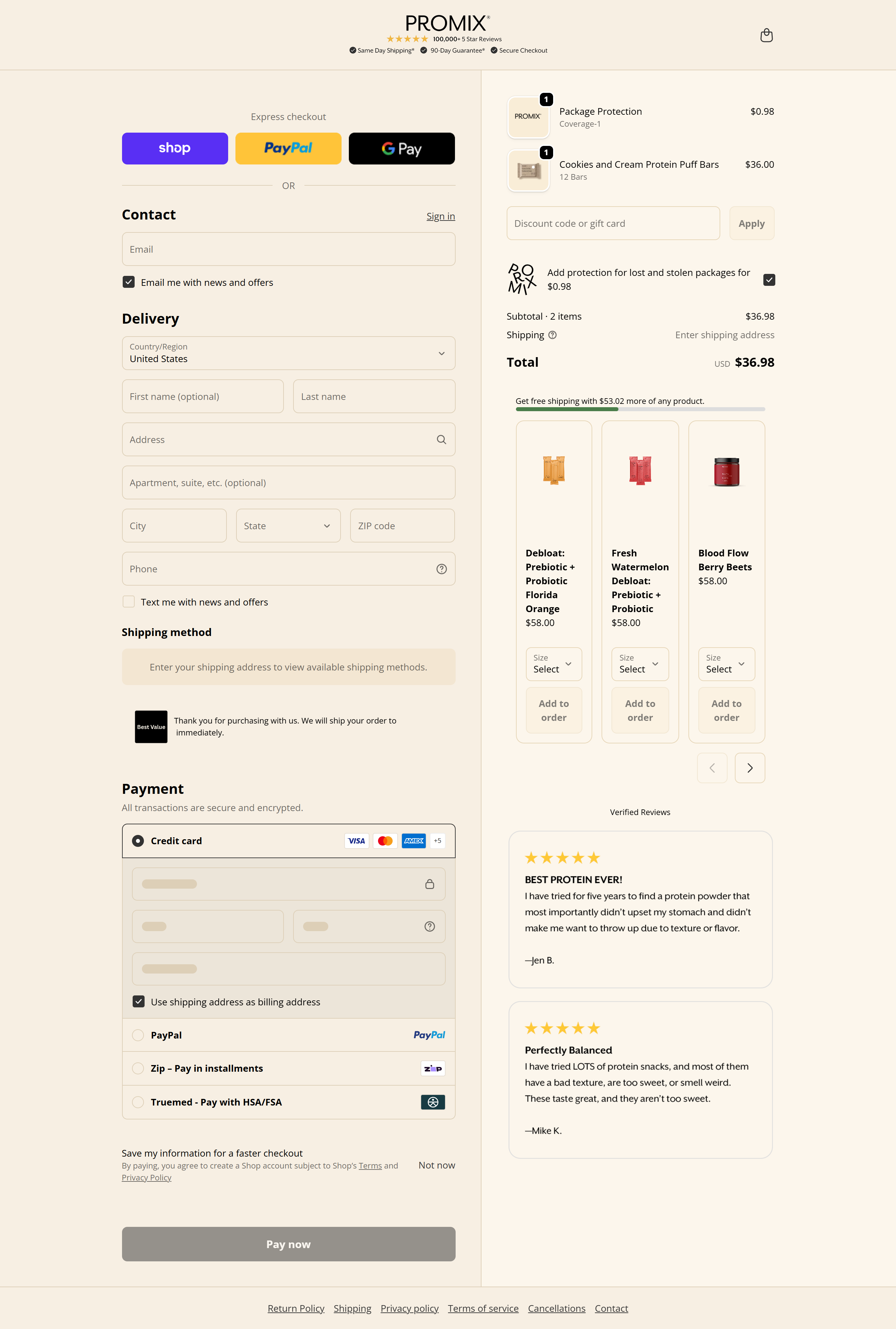
Promix
<aside> <img src="attachment:3ba59a6e-e958-496c-ad6f-1d875bf1db36:a9jlvb.webp" alt="attachment:3ba59a6e-e958-496c-ad6f-1d875bf1db36:a9jlvb.webp" width="40px" />
Full desktop and mobile swipes, sorted by vertical.
Open the checkout customization collection →
</aside>
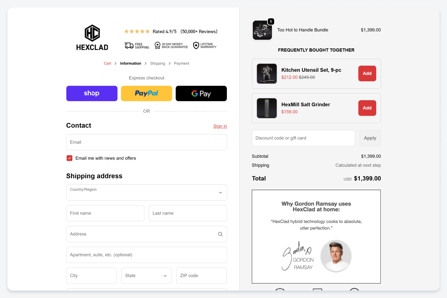
Put your strongest proof next to the logo. HexClad uses its rating, review count, shipping info and warranty. Pick what answers your customer's biggest concern. For an expensive first order, that might be your guarantee.
How: A custom header UI extension, or a checkout logo image with the proof built into it.
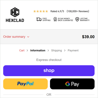
HexClad · Social proof in the checkout header
Use a GIF to draw attention to an offer. Lumière uses one to highlight the subscriber price and how much you save. You could do the same for a free gift or a reward they've unlocked. Keep the animation subtle, and make sure people can still understand the offer when it isn't moving.